Photos by Maria Killam Colour & Design

A natural ‘whistler cabin’ look like that with a modern accent black, in my world the combination does not work! Until I saw it so tastefully done in this hotel and I figured out why it works so well.

A side view of the patio:

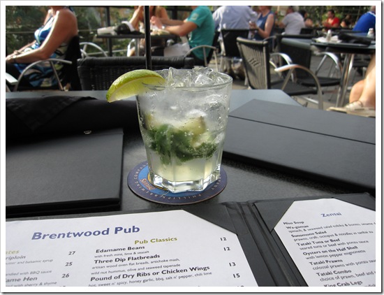
Here’s my mojito; I really took this picture to show you the patio chairs, so comfortable!

Notice how the fascia is not black, and the balcony looks like it was left the cement colour. If the balcony and fascia were black, it would be too heavy and (in my opinion) would kill the natural, organic feeling of this setting. Using black strictly as an accent instead of in a heavy handed way, keeps the look sophisticated, exclusive and serene! On any other exterior, it would be weird not to repeat the black on the fascia, but with an all cedar exterior, it's very well done just the way it is.
Above photo obviously not taken by me
If you need exterior colour advice for ANY other reason, hire a professional.
Related posts:
5 Steps to choosing the Right Exterior Colours
Exterior Undertones
The Best Exterior Trim Colours—NOT Cloud White
Advice to Do it Yourself Homeowners on Choosing Exterior Colour
Glamorous Hotels in London


i agree, black is such a commanding, strong force, it should be used in moderation. i recently completed a building make-over where the clients didn't want to spend the $ to repaint all the black window grids and trim. such a shame, because it totally overwhelms the design with heaviness.
ReplyDeleteGreat post, Maria. It looks like you had a great time too!
ReplyDeleteBlack is such a commanding color that's rarely seen in nature (except when something dies). So when you need to ground a space, to balance, we go to nature for the solutions (biomimicry). The results, pleasure to our eyes rather than raising a question to figure out why it bothers us. Great example Maria!
ReplyDeleteBette
another informative post! Thanks Maria..the views look spectacular there!!!
ReplyDeleteThanks for the big urns with ornamental grass. My wife will go nuts over it. Me too.
ReplyDeleteI like black but I see what your point is...
ReplyDeleteyour mojito looks so refreshing...wouldn't mind one myself! I know you two girls had a good time!
xo
Love your blog Maria. Everything about it actually. I wonder if you've done a post on tray ceilings...I'll take a peek to see if I can find one. Side bar, great tool!
ReplyDeleteThanks, Roberta
Thanks for the tip about color viewers. I figured it would be hard to translate the exact color of my walls in that way.
ReplyDeleteso stunning is right! and the black works like you said.
ReplyDeletexo,
cristin
When I look at something my gut instincts tell me if something is wrong but I don't always know *why* it's wrong. This post teaches us why - thank you Maria.
ReplyDeleteGreat advice as always, Maria.
ReplyDeleteThe black is dramatic and unexpected.
Wish I was there with you and that mojito!
xo
Brooke
see I love black, I think it's a great colour, you may not like my new home maria, there's quite a bit of black exterior, only a little inside tho! Now you've got me nervous... arrrgghghgh
ReplyDeleteHi Annie,
ReplyDeleteSorry if I wasn't clear, I was specifically referring to an all cedar shingled or siding house with black trim.
With any other house, it would look weird not to repeat the black on the fascia, etc.
I'm sure i would love your house!
Maria
Wow that place is amazing. You are so right about the black, but then you are always so right!
ReplyDeleteReally like the pictures. I wanted to stay there with Aaron a while back but the rates were too high to justify a one night stay. Beautiful place.
ReplyDeleteHi Maria
ReplyDeleteWhat a beautiful part of the world Brentwood Bay is and a great picture of you and your friend..2 stunning blondes. Wish I was there to have one of those yummy mojitos with you.
What a beautiful place. The unusual use of black on cedar is really dramatic and chic. And, thanks to you, I can see how it could easily get too heavy. This is not a combo I see in my area. ((or maybe I just haven't noticed?... I'll be on the lookout!))
ReplyDeleteI think the black works well because it's used as a consistent accent color throughout the entire "brand" of the spa. Many exteriors just have those ugly black windows (I typically HATE them) and there is usually no continuity with anything else. I love that the black was used for the lounge chair cushions, the umbrellas, the signage, the menus, the tables, the napkins, the railings, the light fixtures...even down to the straws! And the blacks are introduced in different textures, so it gives the eye a break.
ReplyDeleteThe gorgeous natural setting doesn't hurt, either. :)
Nice post!
Kelly!
ReplyDeleteI didn't notice that even the straws were black! And I agree with you , it really works repeated everywhere in the design concept!
Maria
Another great post, Maria! Always love coming here, learning lots AND looking at your terrific photos! It's been said in the comments above, but that mojito looks so refreshing!!
ReplyDeleteVictoria
Oh my, oh my, oh my what a great hotel...I am thinking a great place for a weekend away with my hubby so time...
ReplyDeleteI love the deck chaises around the pool
Thanks for sharing this wonderful place with all of us.
On our way to Courtenay, BC (my moms) tomorrow for 2 weeks, wish I had the time or extra money to stay there while on the island, but no such luck, maybe next year.